Process: Reverse engineered heritage
I thought it would be fun to dive in and share the process behind a few of the pieces of my Panthers branding exercise.
The main element I knew I had to nail was the original mascot design. For the project, I set up the Panthers hypothetical founding date at 1955. The first step was to research and get the tone and feel for what was the prevailing style at the time. Football teams were not "brands" as you think of them today. They weren't highly polished, consistent and coordinated. Because of production methods at the time, the typefaces were often very different from one medium to the next, but many teams had mascots. These were very illustrated and often had a real sense of exaggeration and fun. For the Panther, I didn't want him to feel goofy, but wanted to go after a bit of exaggeration and a wild-eyed look.
This was one of those cases where I could see it in my head, but didn't completely trust my ability to work in this style. I actually had the thought to contact the amazing comic artist and writer Jason Latour, who lives in Charlotte to see if he wanted to collaborate. He has a really unique, but classic style and knew he could pull off something great. After thinking more about it, I decided to take it on myself. A huge part of doing a personal project is doing something you are unsure of and trying to learn something new in the process. I began with a really crude sketch of the general proportion and shape.
Embarrassing pencil sketch
A little sidebar about sketching here. I think the importance of the sketch is that it be a seamless part of your process and function uniquely for you. Some people like to work out every detail and arrive at something very tight. I often find it's just enough to get the general composition and move on to the next phase. Do what works for you. You can see that my sketches were very crude, but got me down the path far enough. I have always been a pencil sketcher, then onto mouse and keyboard. I recently purchased a Wacom pen that allows me to draw on my iPad using ProCreate (per the recommendation of Joey Ellis). This has been an inexpensive way of exploring whether a tablet would work for me or not. I'm liking it so far.
embarrassing ink sketch
I did the basic pencils, then worked with a thicker ink brush. Again, the sketches are nothing special, but I knew this needed to have a hand drawn quality to them, so this foundation was important. I then live-traced my sketch in illustrator and refined vectors from there.
Pencils, inks, live-traced
The ultimate test was to make sure this guy felt at home amongst all the early mascots. I felt like he could really belong, so I felt good about where I ended up.
The other part of the exercise was to create lots of ephemera that would have been created in support of the team. I did an image of "first game" memorabilia and one the primary elements was the game day program. Again, research is key.
Sampling of research into program covers
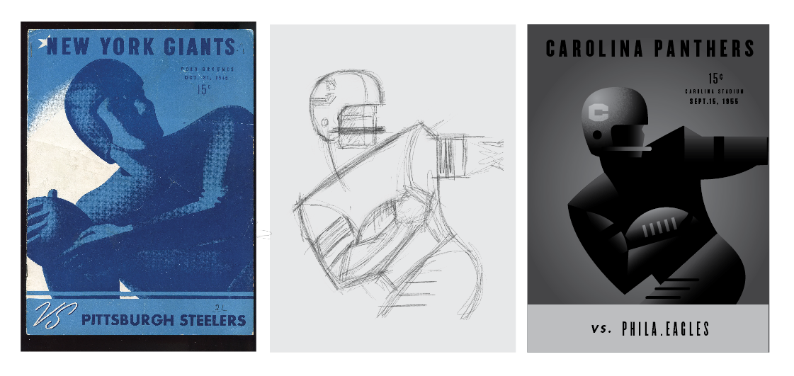
I found an image I really liked and wanted to achieve something in a similar style. The date was wrong, in the 40's vs. the 50's, but I thought it still evoked that era. I did a simple sketch in my car while waiting for Hungry Howie's pizza to take home to the family on a Friday night (not kidding).
Research, sketch, vector build
I liked the pose of a runner looking back and extending his arm. I also wanted to do something more geometric and hard edged. Often times these program covers were just generic art with customized type printed in one color, so they could be used by multiple teams. I wanted to reinforce the "C" helmet design I had done, so I made mine more custom.
Vector to finish compare
That's it. If you hung with me through all that, I hope you enjoyed and/or learned a little something. You can see the original project here and you can grab a "Bad Cat" shirt over at Cotton Bureau.


