New Work: Afew Identity
Back during my MAX100 project, I received a ton of support from Afew Store in Dusseldorf Germany. They not only purchased books to sell at retail, but converted a portion of their store to display artwork from the book. So it was a real honor to get to work with the guys from Afew on their 5th anniversary on a rebrand.
original afew mark
The original logo was simple and clean and had a little detail in the "e" meant to represent a slice of something larger. Expressing the depth of product and the variety of their brand was important, while establishing a strong, consistent system.
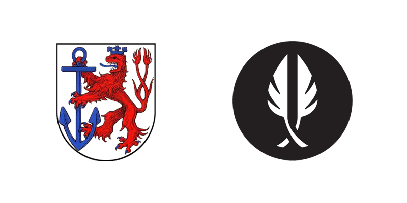
This last approach got the best response. These shapes were an interpretation of the key element in the Crest of Dusseldorf, the two-tailed lion.
We were pretty sure this direction was the most compelling, so the next phase was to explore the style of this tail element, explore type and to do one last attempt at an idea that carried over the "pie shape" from the original mark.
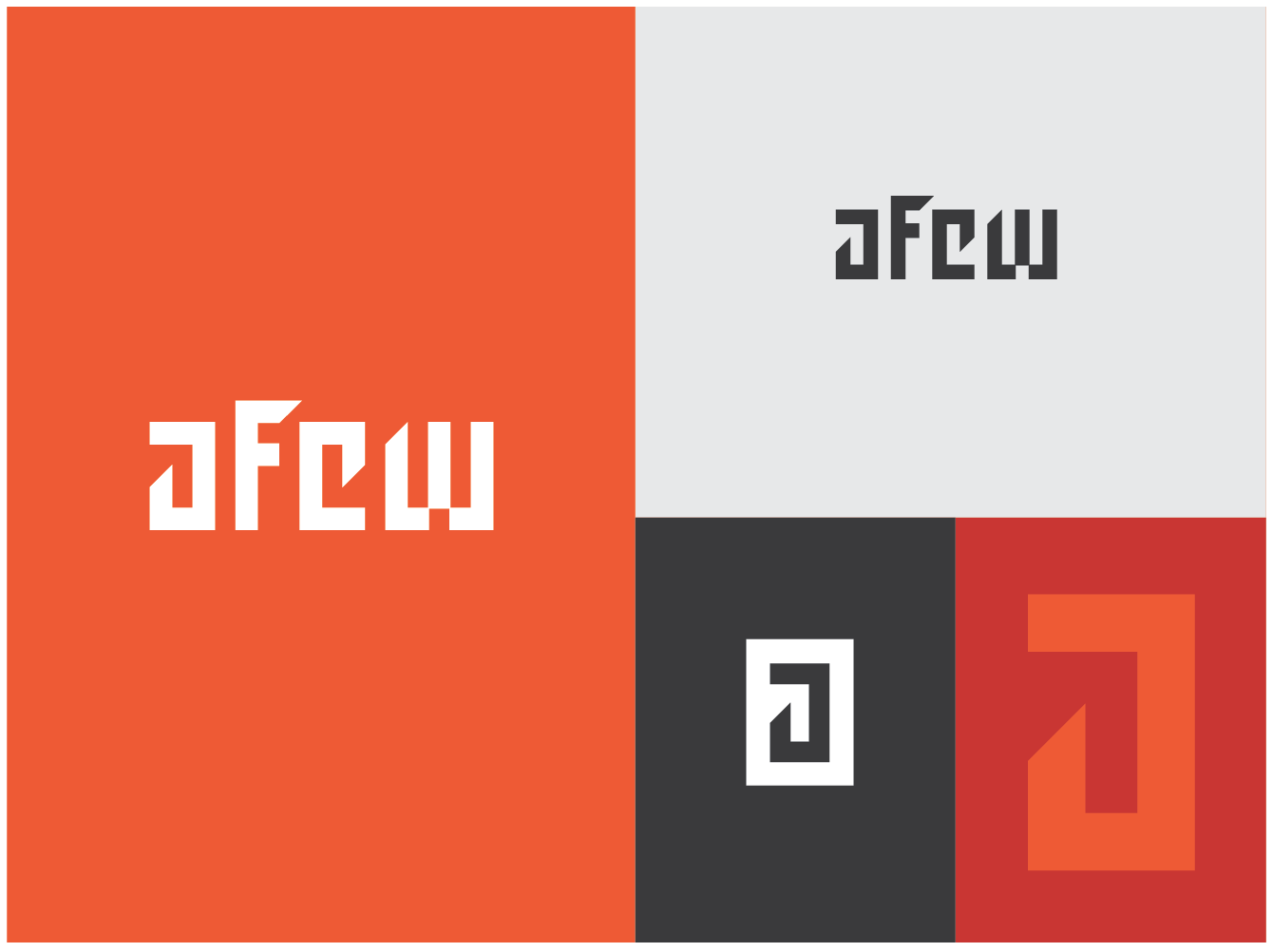
After this last round of exploration, we felt the first style rendering of the tails worked best. I made some final tweaks adjusted tolerances. We hung onto the varied text weights from the original and kept the slice element.
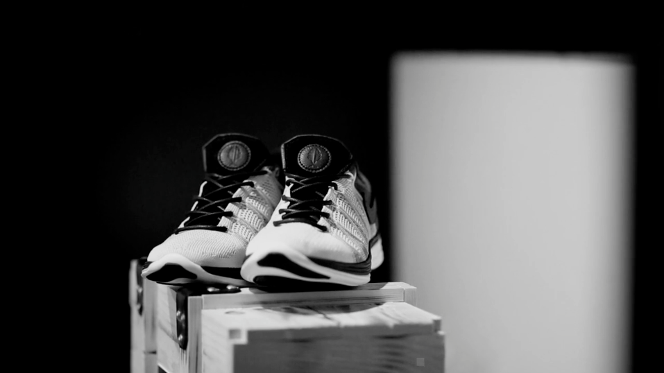
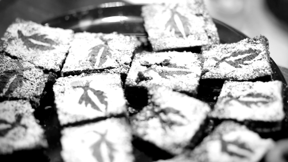
Afew just had a big collab with Nike & 5th Anniversary event that you can check out here. And for the first time ever, one of my logos appeared on brownies.
