Process: Kern and Burn
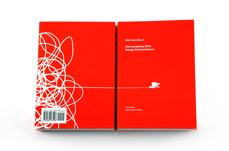
I had the privilege of contributing an illustration to the Kern and Burn book project. This book dives in with design entrepreneurs and the list of contributors, both writers and artists, is impressive. Tim Hoover and Jessica Heltzel have put together something really special and it all began as a passion project, something I have a soft spot for. I thought this would be an interesting project to take a look at, because honestly, it was one that I struggled with.
The brief I was given was to illustrate the concept "design is in demand." I started as I usually do, with lots of very rough sketches. Working in a group project like this where you know the other artist's work, can be tough. For me there is definitely an intimidation factor and the pressure to do something really good can work against you. That was the case on this one. Despite the slow start, I hit on an idea I liked a lot and thought was worth exploring. A shelf of products expressing the idea of "in demand." Like the mad rush to the grocery store when everyone hears that the snow is coming. I worked from a really simple sketch, but dove into vectors pretty early, because the style I was going to use was very simple.


Once I got it this far I realized it was not illustrating what I wanted it to. I was trying to juxtapose fluff and style versus real design and problem solving, but it was becoming a different idea and was clouding the core idea. Visually it didn't express "demand" but rather emptiness or missed opportunity. In the middle of this I had another idea and thought it was worth the detour to see if there was anything there


I wanted to explore the idea of designer as superhero. Like Batman, equipped to solve the problem and being urgently called. Despite it just about always being a good idea to work in a Batman reference, at about this point, I was really struggling. The brief was so simple, but all of my ideas felt off the mark. I was pressuring myself to do things that were more showy. Every simple idea I had, I discarded because it didn't feel like "enough." I went back to a few earlier sketches to see if there was anything there.

I grabbed a book off my shelf and tore out one of the pages. I added half of the word "design" in post. I thought this was pretty cool visually and getting closer, but didn't quite feel on the mark either. "GN" is in demand? I wanted to push a little farther.
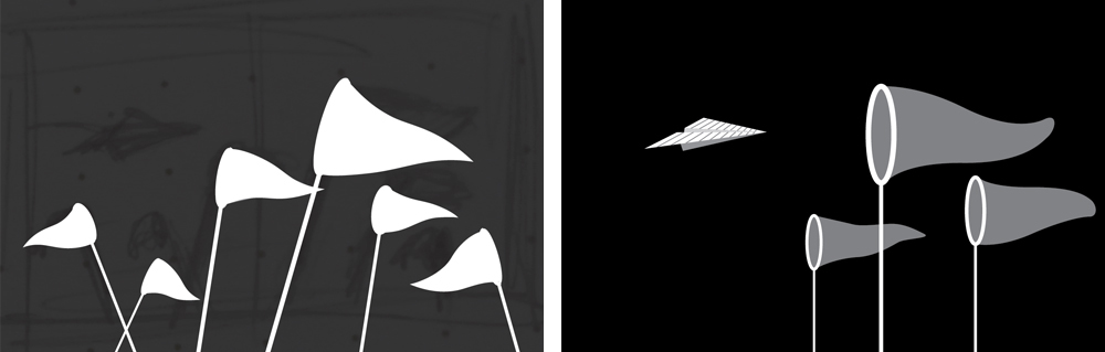
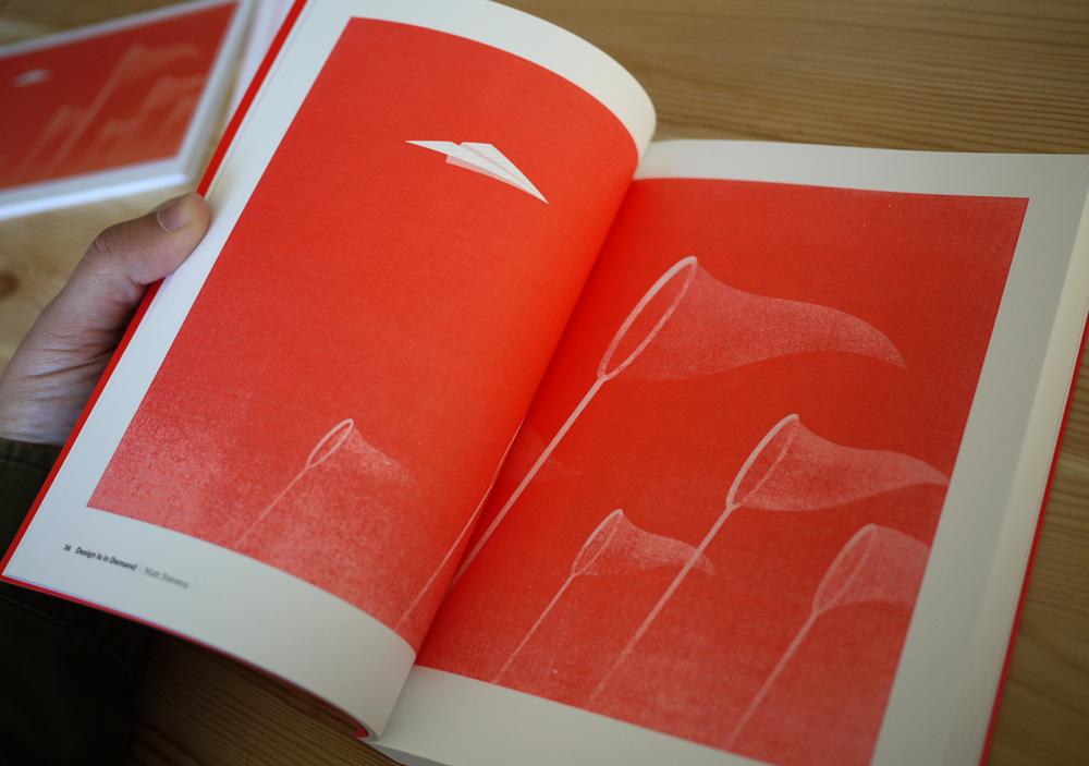
I had an early idea of these butterfly nets, reaching up to try and capture a paper airplane. I worked over top of some thumbnails in rough vectors and did a few different takes on it. I really liked the simplicity of this. There was a feeling of pursuit or capture that I thought was really strong. I did a final execution.

I actually sent this to Tim and Jess as a final. About an hour after I sent it, I wasn't happy with the final composition. The directions of the nets felt haphazard and the piece didn't have much energy or direction.
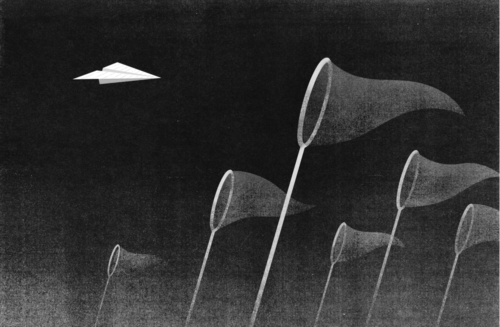
I liked the feel of this much better. I submitted this as my final. I think the lesson for me here was not to over-think. Trust your gut and do what you do well. If you get a minute, please go support this great project.