Good Movies as Old Books / 02: The Hard Way
Thanks for all the nice feedback on my first post, The Easy Way. I wanted to follow up with some process about those entries where the original idea didn’t work out, or where I struggled to land on something that I felt good about. I still have books and prints available in the store if you are interested and haven’t had a chance to snag a copy. Ok, let’s dive in.
As I outlined the positive aspects of personal projects with lots of freedom, the flip side of the coin can be the difficulty of creating something in a vacuum when you struggle to nail the idea early.
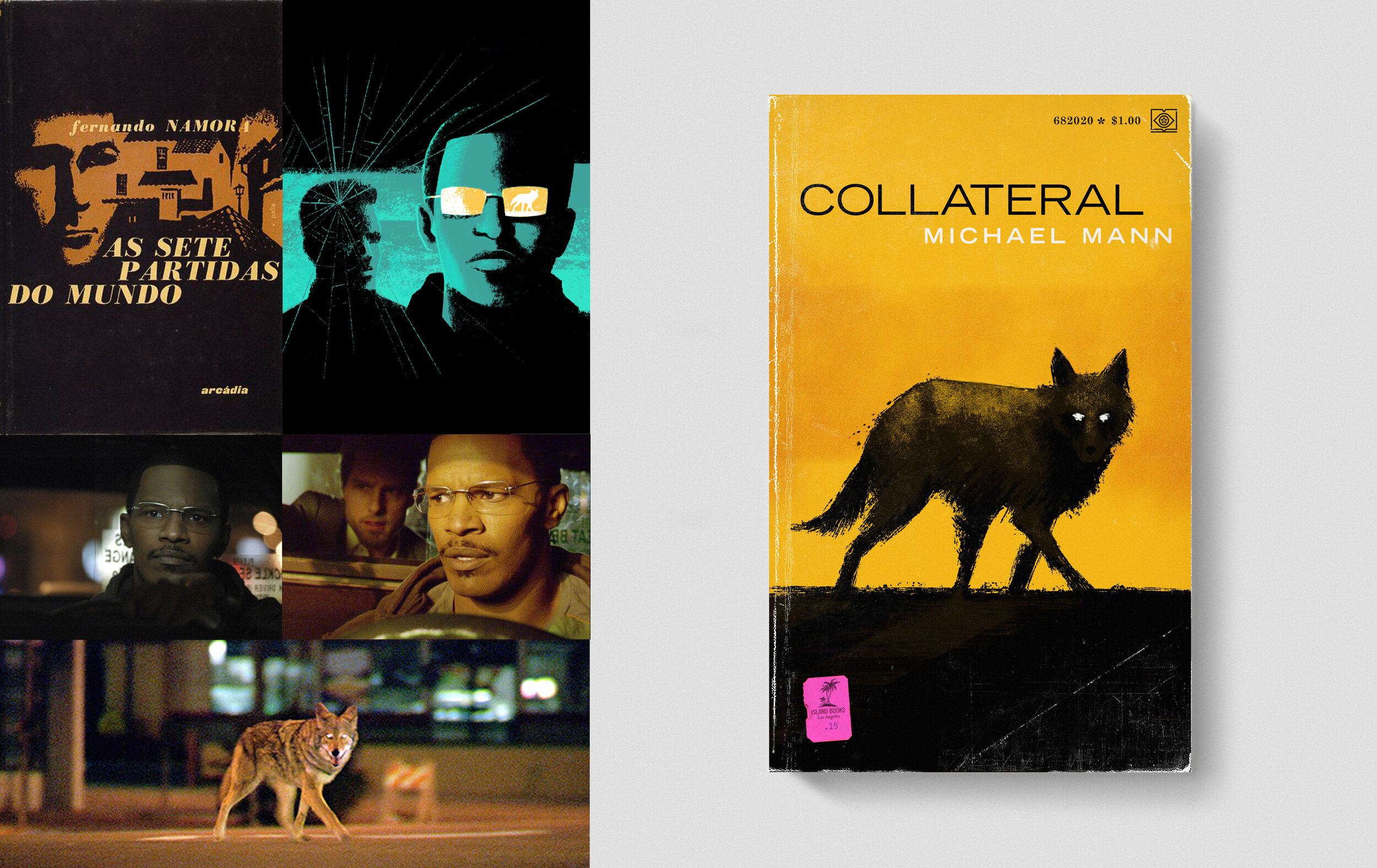
COLLATERAL / I had a very distinct idea early on to do the scene the in car. Since most of the movie is about these conversations and this dynamic between the two leads, this was the iconic moment I was sure I needed to capture. I played off the book cover in the upper left, and wanted to create this claustrophobic band across the front that just faded into black. I included the coyote that makes an appearance towards the end of the movie as a small visual moment. Once I created it the idea felt muddy and I found myself much more interested in that coyote image. The cover idea I felt so good about, once I saw it, felt too literal and without much punch. I decided to focus in on the coyote as my primary element and created something that was much more striking and memorable.
This cover reminds me of the best and most impactful piece of advice I ever got in all my college years. I was in school for design and illustration, unsure what I ultimately wanted to do. I used to work in a very realistic, labor intensive colored pencil style. I would use prisma color pencils on black board and I was creating these very detailed sports based illustrations. I did this large collage illustration of Michael Jordan and I had a very muddled idea to show all these aspects of his persona and also cram in a statement about hero worship. I had these iconic action sections, and also pieces that made a statement about him as a persona and the controversy of murders over Air Jordan shoes. Way down in the lower right amongst all these very realistic drawings I had drawn him in an iconic dunking pose, all rendered in a rough, simplified stained glass style. It was my way of talking about keeping our heroes in perspective. My professor, Robert Kauffman, came over and covered up all this work, representing all these hours and just framed that little stained glass illustration with his hands and said, “this is it, this is your idea right here.” Ever since then I’ve really tried to simplify and cut away anything that gets in the way of the main idea. It had a huge impact on the way I work.

STEP BROTHERS / Well, after all that deep rambling, lets change gears and talk about one of my dumb favorites. I had this one in the hopper for a long time and really wasn’t sure how to tackle it. There’s so many ways to go with a movie that’s so packed full of stuff. I originally did a lot of sketches and landed on this idea in the upper left that was simple little subtle drawings, representing all these things about the two main characters. The idea was to have them overprint and overlap, so that the two colors ended up making the illustrations make sense, one completing the other, conceptually. It sat in the “completed” folder for a long time but I was never happy with it and kept coming back to it to find a new angle. I eventually found the cover in the lower left in my research and it sparked the approach I ended up using. Even the color palette was an influence. I also focused in on just one scene that, as a still, really sums up the movie well. You can also see at the top middle, where the type style came from. This was drawn in Photoshop on the Cintiq and then composited in Photoshop.

THE MASTER / I actually rewatched this movie as I was working one day (had it going to my left on the second monitor) to come up with an idea for a cover. The scene where the two men go to prison really struck me. It seemed like a great summation of the themes of the film. Lancaster over on the right, completely relaxed, waiting to be released, while Freddie struggles in the cell next to him, hands bound, thrashing around in futility. I added the key in Lancaster’s hand to reinforce the idea that he held the power. Ultimately I wasn’t happy with the style and outside the context of the film, I didn’t think it was as impactful as I wanted it to be. Again, like Collateral, it was probably too literal. I took another dive into covers from the era of the film. A lot of deco design in both illustration style and type design. I had this idea of Lancaster inside Freddie’s head, which is an even more important aspect of the film. You can see my rough sketch on the lower left. I went straight into vector from that. You can also see my reference on the two leads that I used to get the physicality of the figures right. This was all vector and then composited in Photoshop.
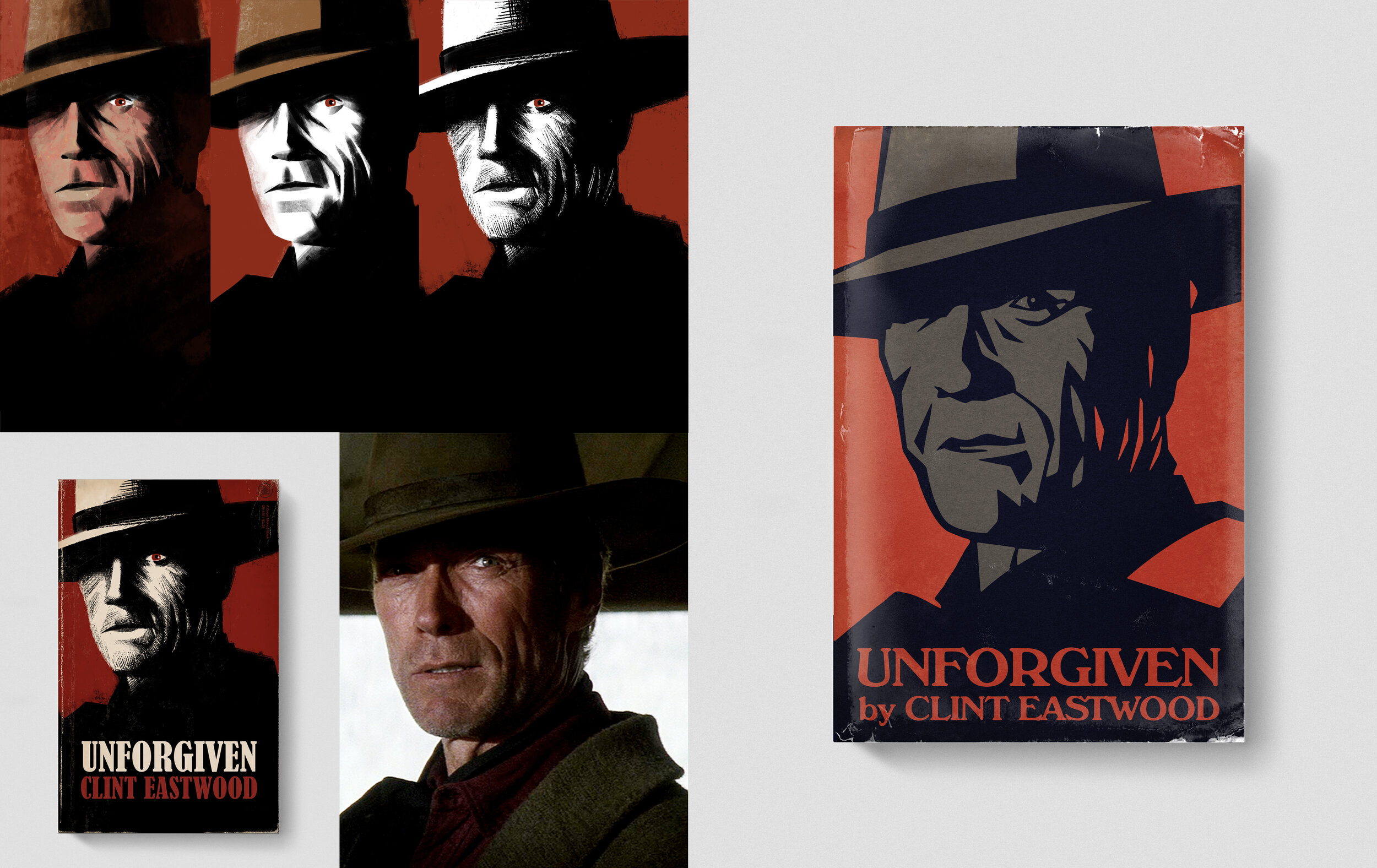
UNFORGIVEN / This was not a struggle to find concept, but was really more about style. I found this frame from the movie that I loved. It really captured a man who had moved on from darkness, but was being pulled back into that side of himself. I almost saw this as a monster with a glaring eye. A lot of the studies I did I tried to capture that feeling, but went too far and felt too grotesque. Ultimately I pulled back and went much more graphic with this one for the finish. This was all vector and then composited in Photoshop.

COLLATERAL / Here it is. The one you’ve all been waiting for. One day this will be like the copies of that Disney movie that some animator snuck a naked lady in the background. I had this idea to make the streets of LA form an abstract scorpion. The scorpion is the iconic element from “The Driver’s” jacket and has become an unofficial symbol for this film. I wanted to do something subtle, but graphic. What I ended up doing was making something that looked like a penis. You can see my research in the upper left and one of my original sketches. If I had gone more literal with the map, I would have avoided the “Hog City Incident” as it is now called (by me). But I tried to go more graphic and it totally looked like a scorpion to me until I posted it to instagram and every other person told me it looked like a penis. You can see my original lower left and my desperate attempt to save it, as well as proof that everyone was laughing at me behind my back. Ultimately, I took the scorpion and rendered it in neon and did my best to mimic a book cover from the 80’s/90’s era that so much of this film references, particularly in the soundtrack and score. Less truly is more.
Thanks again for reading this second entry. For my next post I’m going to talk about little visual nods, easter eggs in the illustrations and some of the subtle visual relationships that are in the book that you may have missed (and that are totally possible that only I care about…we’ll see!").